This is my finished piece for Basilica Chymica, an invitational exhibition at Hoofprint Workshop that combines the work of artists and chefs based on the theme of alchemy. You can read more about how this project got started in my previous blog entry.
Over the years, I have developed a flow of ideas that consistently emerge out of a practice involving spilled ink on paper followed by drawing. I found it really exciting and scary (in the best way) to step out of my usual way of working and try something completely new – especially with a time constraint of only a couple of months. The whole project came together in a flash. Although I’m as content as ever with the results, I also somehow feel surprised, partly since this was my first attempt at printmaking, and partly because the ideas came seemingly out of nowhere. I faced a similar experience when I created Private Eye for an exhibit in 2011.
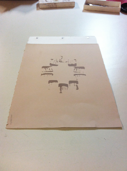
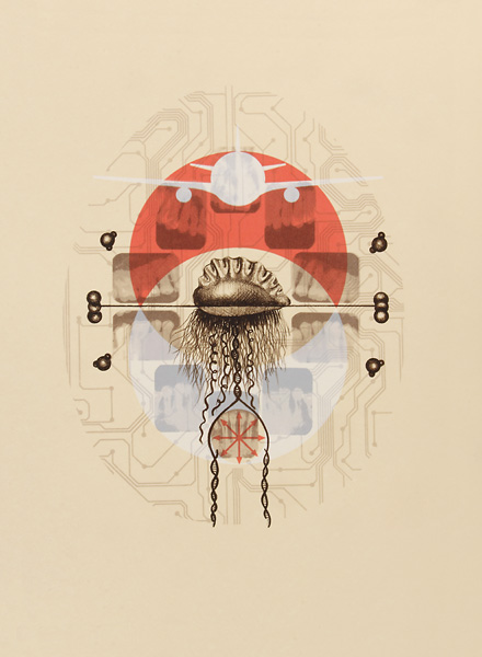
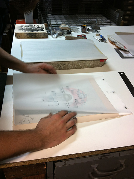
In keeping with the alchemy theme, I knew that I wanted to reference occult drawings and prints from the Middle Ages. I decided to begin by creating a direct screenprint from a set of early 1990’s X-rays of my own teeth, to correspond with the food component of the exhibition. Master printmaker Liz Born chimed in with her silkscreen printing experience and suggested that we create a threshold print by placing the X-rays directly on the UV exposure unit in order to create a different screen for each tonal range. This method created a result that is uncharacteristic for screenprinting – the printed image retained a lot of the detail from the original films through varied exposures. One of the layers is pictured on the left. In the final image, the teeth have four exposures layered together.
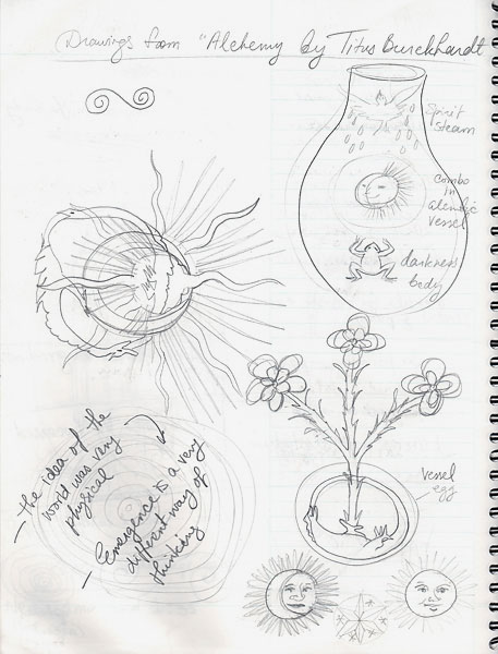
Once I arranged the X-rays in a way that looked interesting, I had absolutely no idea what to do next. This was the most difficult step. I started reading and looking up various articles about the evolution and transformation of human teeth. Evidently, one theory states that the top and bottom rows were perfectly aligned until eating utensils entered common use. This in turn led me to think about DNA mutation and natural selection, which brought me back to the properties of matter and life, and the paradigms that ultimately guide our understanding of these things.
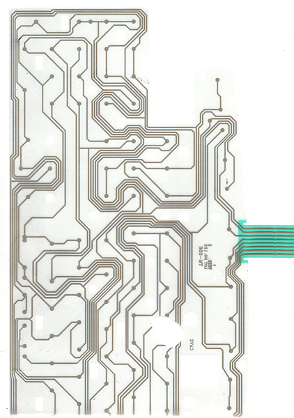
I tried to recognize the overarching concepts that shaped alchemy in the first place – to imagine common worldviews throughout the Middle Ages in places where alchemy was prevalent. Religion often dictated how people lived, and the world was seen through a dichotomy of the material-spiritual. Ultimately, I decided to work on an image of our current worldview that includes a faith in science and a dependence on research to guide us into the future, at least in the post-industrial world. Instead of approaching the universe in material vs. spiritual terms, there is currently a greater interest in emergent properties to describe how matter transforms and interacts. Various other things came to mind: network systems, artificial intelligence, homeostasis… I suddenly remembered that I kept this old circuit board hanging on my studio wall. I had pulled it out of a broken computer keyboard many years ago with a hunch that it would come in handy some day.
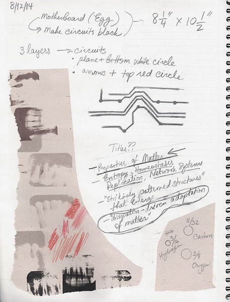
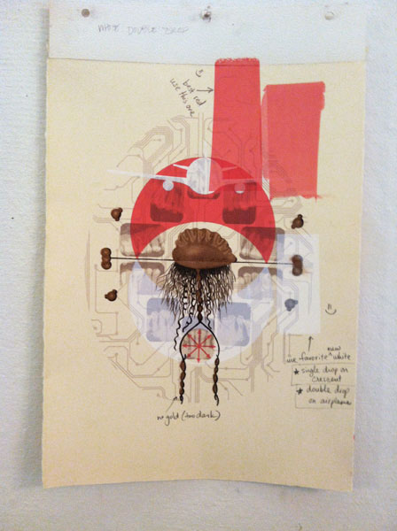
I knew that the finished print needed to feel as perplexing as some of the ancient drawings with symmetrical images of solar eclipses, celestial bodies, unimaginable creatures, and objects congregating to form a bizarre apparition. In keeping with the theme of alchemy, I decided to build my own cryptic iconography based on a contemporary description of the properties of matter and life – while at the same time retaining some of the symbolism used in the original texts from the Middle Ages. This was the iconography that I came up with:
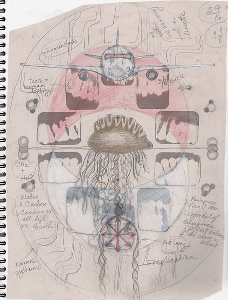
Portuguese man o’ war
emergent properties (this is a colony of organisms, not a single creature)
Water and carbon
components of life
Diverging arrows
entropy
Airplane
homeostasis
Circuit board
network systems
DNA strands
replication
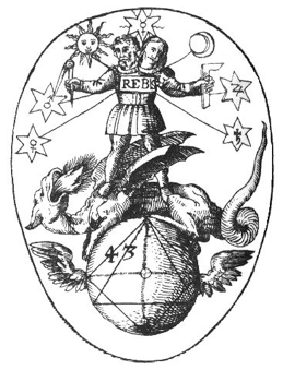
I also retained some of the symbolism that was present in early alchemy manuscripts. The oval shape in the background references the philosophical egg within which the hermetic transformation can take place. The two crescents in my print represent the sun/red/sulfur/king and the moon/white/mercury/queen from alchemical texts. When these two elements meld, the androgyny incubates in the vessel (the egg) and goes through various stages of transformation to ultimately form the philosopher’s stone, which leads to perfection, gold, and eternal life. On another note, the pastry chef I was paired with, Suley, worked with the egg/vessel theme as well, using red and white as the main colors in her dish, which will be presented at the ticketed event on October 3rd.
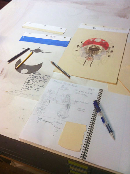
I had a general sense of the combined images that I could divide into many layers for the print, but I still needed to make more specific choices about the colors and textures. I decided to keep the egg-shaped circuit board along with the X-rays relatively light. I wanted them to be similar in hue to the paper, which was definitely going to be an off-white/beige to reference old yellowed paper while at the same time allowing white ink to be visible. The first few layers (circuit board and teeth) were screenprinted in very transparent ink, in order to incorporate some of the background paper color.
The crescents, airplane, and arrows also needed to be transparent in order to show the previous layers through the ink. This created an ethereal quality to the print. The red and white took quite a bit of fine-tuning, as the transparency varied based on the color of the ink and the amount of clear medium added.
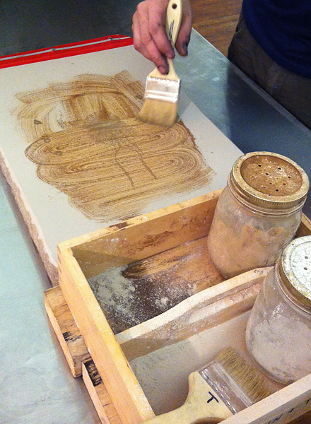
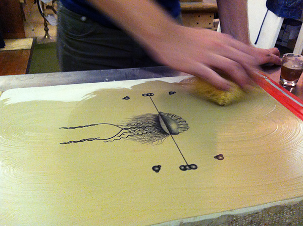
Next, I needed to make some decisions for the man o’ war. We tried layering it on top of an opaque silhouette of gold ink, but that disguised some of the drawing lines and gestures, so I just decided to go with a brownish-black ink alone. The opacity of the brown ink made everything else recede into the background. Gabe Hoare, a lithography expert and master printmaker, did an amazing job preparing and etching the litho stone that we used for the man ‘o war layer.
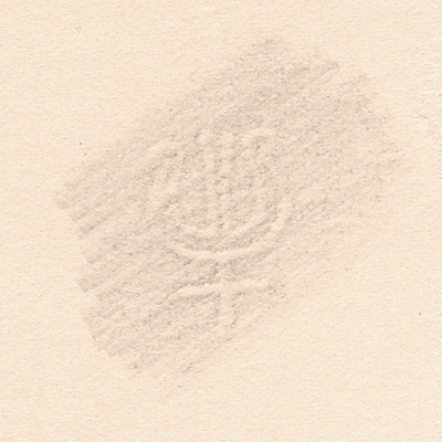
While we were working out all the layers, I came across a smooth and beautifully colored sheet of scrap paper that I really liked and wanted to use for my final print. We found this watermark symbol in one of the corners and tried figuring out who made this paper. The curator Raeleen Kao’s knowledge of papers is uncanny – as soon as I described the paper and texted her a picture of the watermark, she recognized it as the Magnani Pescia brand.
The print is ready. This was a lot of fun, and I can already see myself craving more printmaking in the future. Now I can relax and look forward to the big event where all six artists will have their work on display, including work-in-progress proofs, images, sketches, and let’s not forget the designed food and drinks!
Coincidentally enough, I’ve recently been invited to another unrelated printmaking collaboration with another group of artists in 2015.