
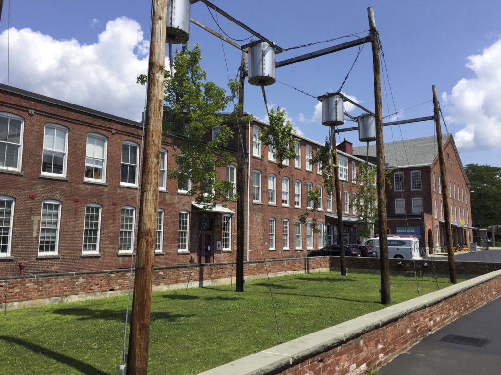
Years ago, back in 2012, several fellow artists and I decided to take a road trip from our residency in Troy, NY, across the hills into Massachusetts. We were going to visit MASS MoCA, a gigantic contemporary art museum nestled in the northwest corner of the state at least an hour away from any large cities and accessible only by car.
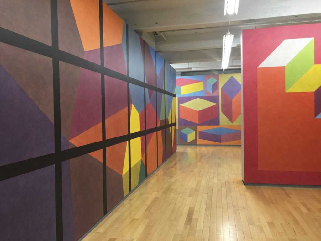
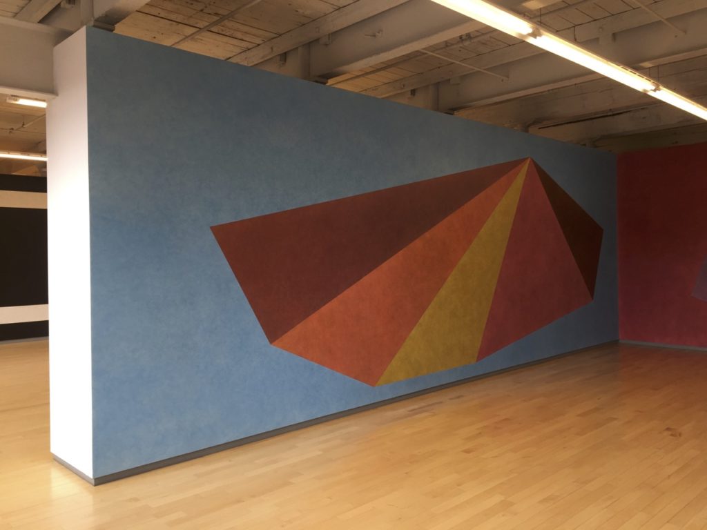
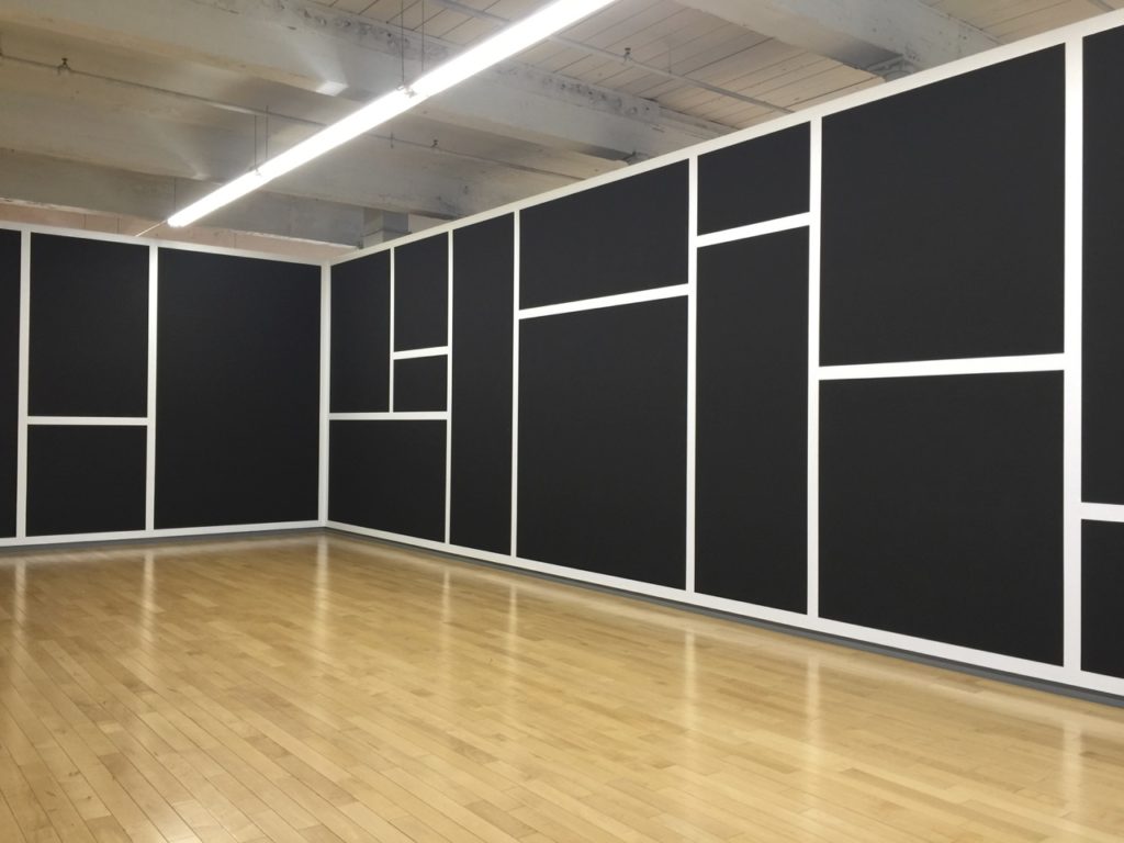
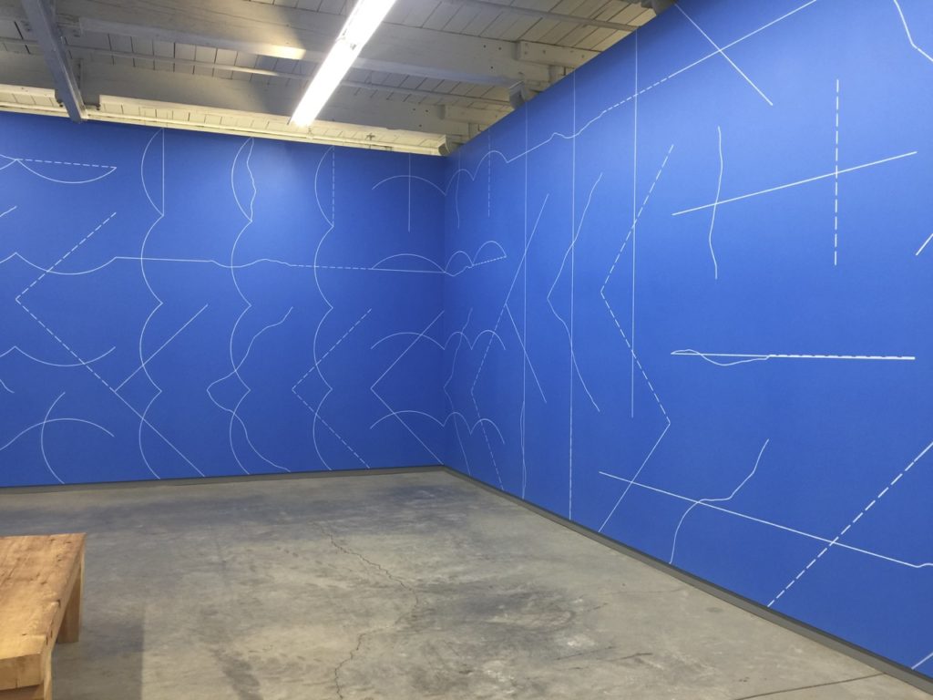
We took a winding road through forested hills to arrive at the factory complex that housed the museum. There was a lot to see. I remember how moved I was by a group show that featured current work by Canadian artists. The Sol Lewitt retrospective inspired a strange eruption of coordinated performance and self-timed photography as evidenced by the images below. It was a memorable day trip, to say the least.
Five or six years later, I was so excited when I found out about their new residency program. I applied and was accepted for the July slot. Unlike larger programs where 20+ artists come and go throughout the month, The Studios at Mass MoCA accepts a dozen artists at a time, all of whom are expected to arrive and depart on the same two dates. However, this residency is also more flexible than other synchronized ones; they are willing to work with artists who have scheduling conflicts and cannot make the full session. Having seen and completed about a dozen residencies, I was impressed at how well-planned and organized this one was, especially considering that it was founded less than four years ago.

Before I write more about this amazing program and the wonderful group of artists I met, I’ll highlight some of the most interesting things I saw at the museum. The experience of walking through was unlike that of a typical art institution. Although MASS MoCA boasts 250,000 square feet of exhibition space, unlike other major art museums it is spread out through multiple factory buildings that—according to the website—are situated on 16 acres of land. The structures feel more like a maze until one becomes familiar; long narrow stairwells and outdoor paths create a scavenger hunt vibe. It requires lots of free time and a museum map. I spent six hours doing a relatively quick walk-through before returning for a closer look.
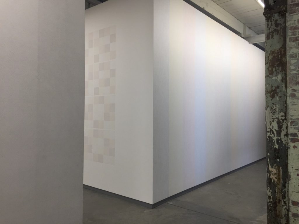
It was so strange to walk through those same Sol Lewitt rooms that I visited in 2012. Through my perception of them I realized just how much I’ve changed. This time, I visited these galleries in solitude. Lewitt’s early wall drawings were most interesting to me; his investigation of methodology and his curiosity at the outcome were most evident in his early work, even when the prescribed instructions weren’t visible.
The exhibition I ended up responding to and loving the most had a title that took me a minute to get past: Suffering from Realness. At first, my gen-X sensibility bristled at the overtly earnest “emo spirit” of the title. But once I saw the work, my attitude changed. I realized that the show was a direct response to the late capitalist social-media-steeped moment we live in. The transformation I experienced is exactly the kind of thing I hope for when viewing art. I should not have been surprised that my favorite show was curated by Denise Markonish, the same person who did the Oh, Canada exhibition I so loved in 2012. This realization reminds me of another epiphany moment back in Chicago when I noticed the work of Claudine Isé and then found out that she was the same person who curated my favorite Wexner Center exhibitions many years prior in Columbus. There are real affinities here.
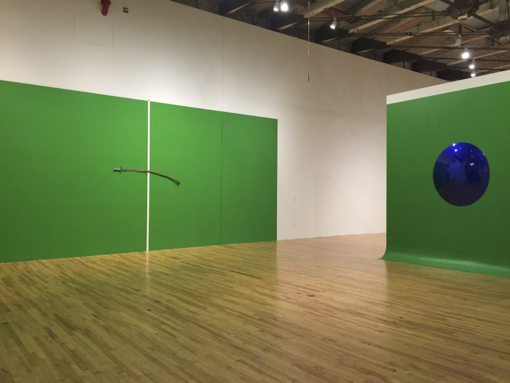
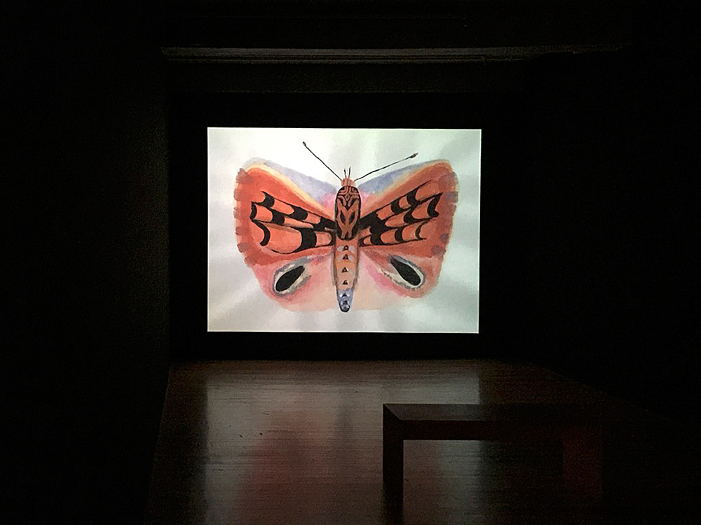
Suffering from Realness included over a dozen artists, many of whose names were familiar. But I didn’t always recognize their work. One example was the mesmerizing video installation by Aziz & Cucher that featured newscasters dancing on set while completely covered and disguised in large tribal-inspired headdresses made of corporate business attire. Having gone to grad school for photography, I remember seeing images of Aziz & Cucher’s altered featureless portrait photographs from the 90’s. Their early work occasionally came up in lectures and discussions and I wasn’t particularly interested. But I absolutely loved their video installation. On the other hand, Wangechi Mutu’s bronze sculptures in this exhibition didn’t do much for me even though I adore her works on paper. I was stunned by the amount of compelling work in the show and so absorbed by it that I didn’t remember to photograph even some of my favorite things. Here is a Louise Bourgeois boulder with eyes instead. (It wasn’t part of this exhibition.)

The museum was so vast that I cannot possibly remember everything I saw, but I’ll highlight a few other experiences. Cauleen Smith’s amazing survey exhibition was the first thing on view upon entering from the main lobby. That show alone was large and engaging enough for an entire day of looking. I really enjoyed her series of drawings depicting black feminist book covers in gouache and graphite on black paper.

I was also captivated by her installation of giant vertical scrolls onto which live video feeds were projected. The cameras for each scroll were pointed at small tabletop installations throughout the space. Each little still life was made up of various artifacts with a video screen behind them, which created an effect normally achieved via green screen.

I’ve noticed so much of this kind of layering upon layering of mediation in work by artists and filmmakers in recent years. I even feel it creeping up in my own work; I’ve become extra sensitive to it. Toward the end of my residency, I went to see Quentin Tarantino’s new film Once Upon a Time… In Hollywood, and was struck by just how much the film employed layered mediation through both pastiche and images of screens within screens, actors playing actors playing actors… It inspired me to consider more intricate layers, gestures, and masking techniques in my own work.
The craziest of all exhibitions I saw at MASS MoCA was probably Mind of the Mound by Trenton Doyle Hancock, a huge installation with toys, large furry domes, videos, and colorful paths that resembled game boards, all interspersed with bizarre comic book style images. The space was made that much more surreal by the screaming children (museum visitors) who chased each other in and out of the large pods.

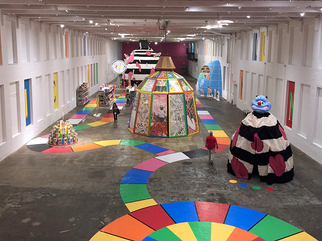
The nature of this museum made many of the exhibitions completely immersive. The James Turrell rooms were probably the most extreme example of this. I felt strangely alienated in these rooms as though I was on a sci-fi thriller set. I appreciated the work, but I also found myself trying to break the brutality by impersonating HAL 9000 to a friend who visited the galleries with me. Photos weren’t allowed in the Turrell rooms.


There were dozens of other nooks, crannies, installations, and exhibitions across the museum. For fear of making this journal entry obscenely long, I’ll end my museum journey with a note on Anselm Kiefer whose textured, lyrical work filled an entire building on the outskirts of campus. His installations created a sense of memory and mourning; they were of a different time and place. The use of a separate, more distant building felt appropriate for this haunting exhibition.

I should write a bit about the residency accommodations for the sake of anyone interested in details. I requested natural light and planned on using smaller paper, so the studio I received was perfect and exactly what I needed for my purposes. My studio was on the smaller side (around 10’x14’), but there were several larger ones available for artists who required more space.

Most studios had high ceilings and lots of natural light. All of them were private with locked doors. Some were completely enclosed, and some had partial walls. One had beautiful translucent walls made of some kind of frosted plastic. Due to the large variety in spaces and layouts, it was important to specify needs in terms of space, privacy, and equipment. The communal area had a shared slop sink and a well-equipped storage room with extra tools and furniture. Most studios were housed in the same suite as the residency administrative office with a shared coffee machine, a water cooler, a couch, and a few bookcases.

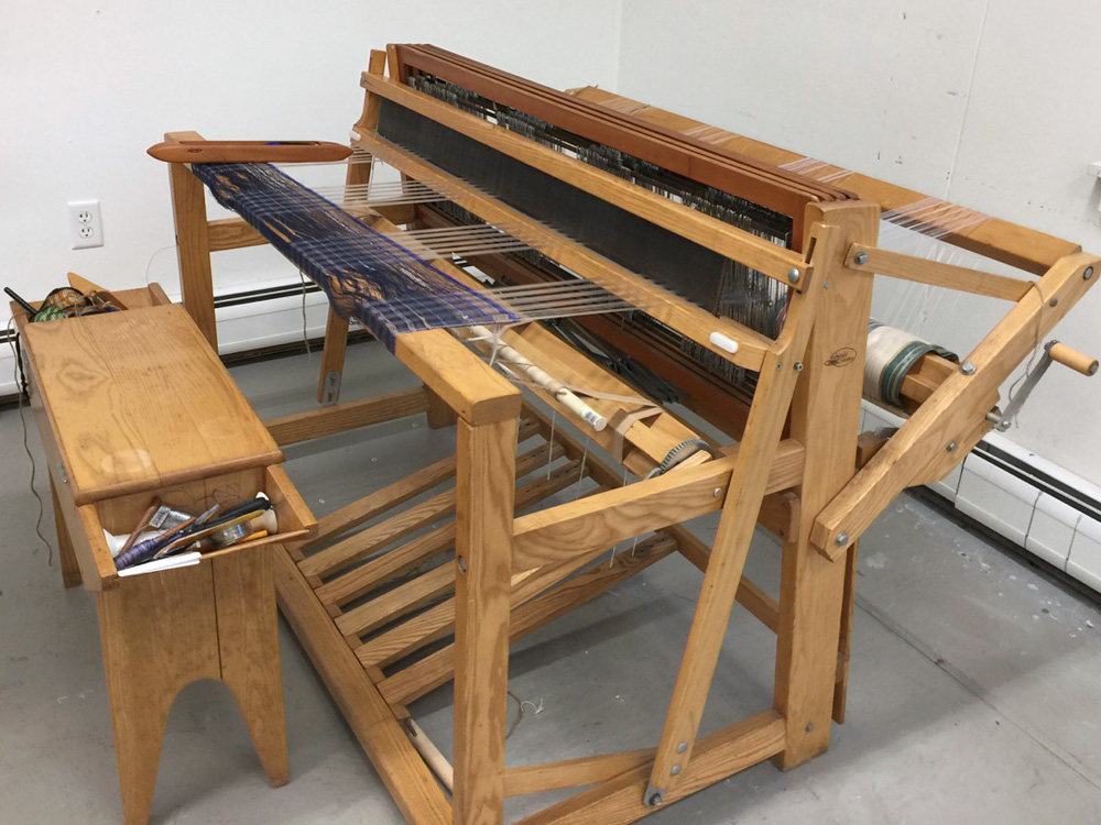
The other studio building had a large shared area with communal printmaking and weaving equipment, with four studios branching off of the main room. The entrance hall leading into this building smelled strongly of bacon from the barbecue restaurant next door, which may be delightful or appalling depending on your tastes.


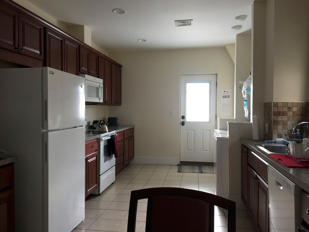
Housing was conveniently located right across the street from the museum. These were probably the best living spaces I have seen at a residency: newer apartments with four large bedrooms (four artists per apartment). The bathroom had a soaking tub; the kitchen included an electric stove, in-unit laundry, and a dishwasher.
Lunch was provided by the program. Each evening we selected our lunch via email from the museum café, Lickety Split, to pick up the next day at 1pm. The menu included salads, wraps, and sandwiches. I enjoyed this aspect of the program as it didn’t disrupt the work. On some days I took the box back to my studio so I could continue working immediately. Other days I ate either in the café or outside with other artists. I liked the food—especially the salads, which are not usually my top choice. One time I found a cute caterpillar in my salad, evidence that the greens probably didn’t have strong pesticides or bleach added.
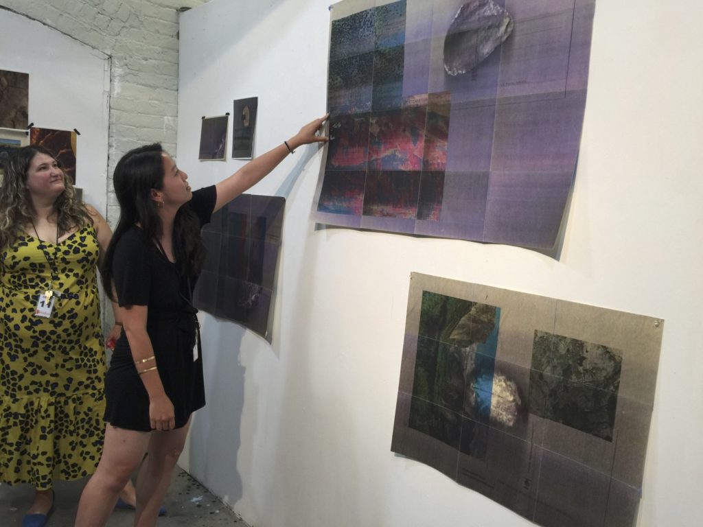
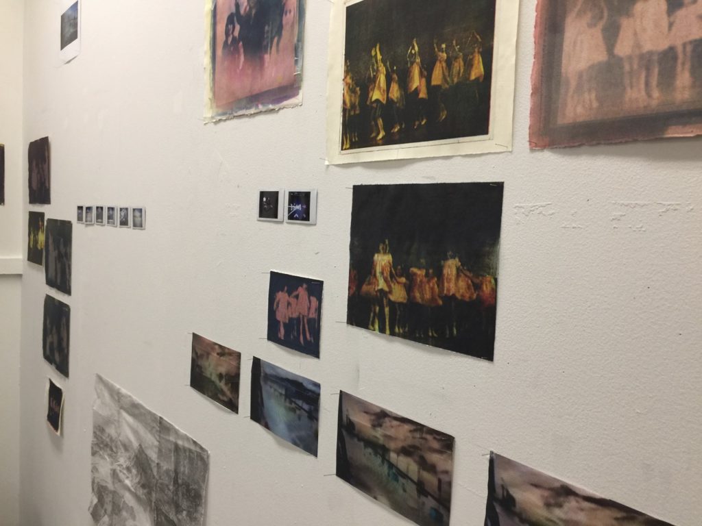
One of the artists, Rachel Guardiola, had to leave the program a few days early, so she invited me to her studio before moving out. I was so excited to see cyanotypes. Her work resonated with my background in photography and science:


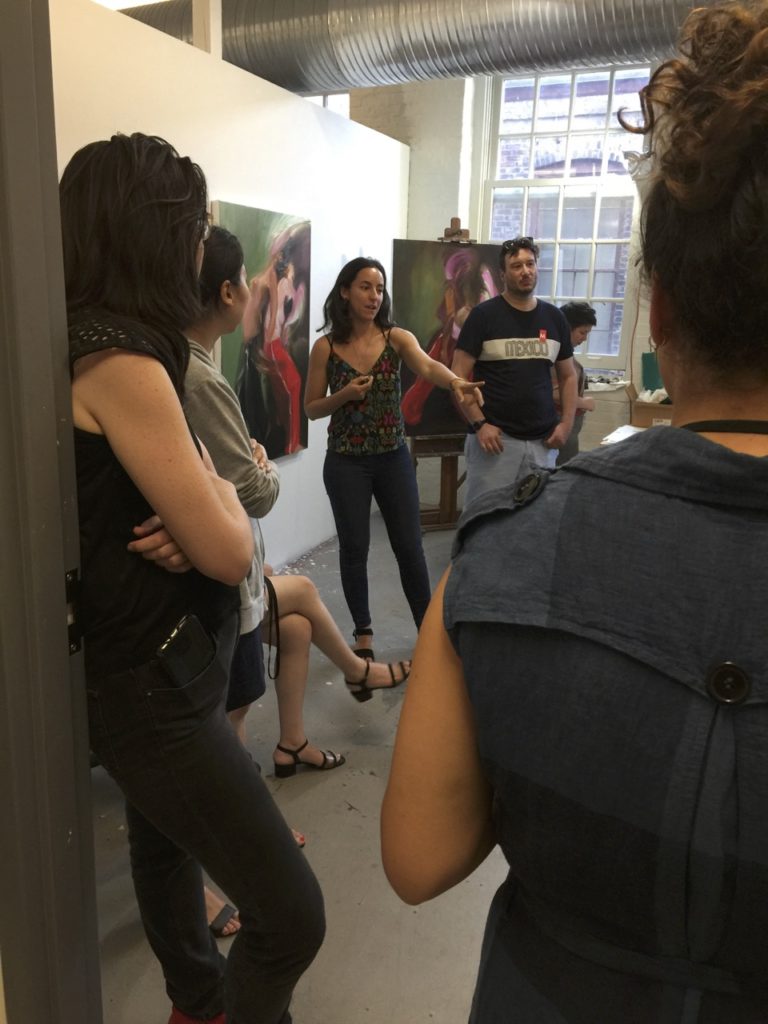
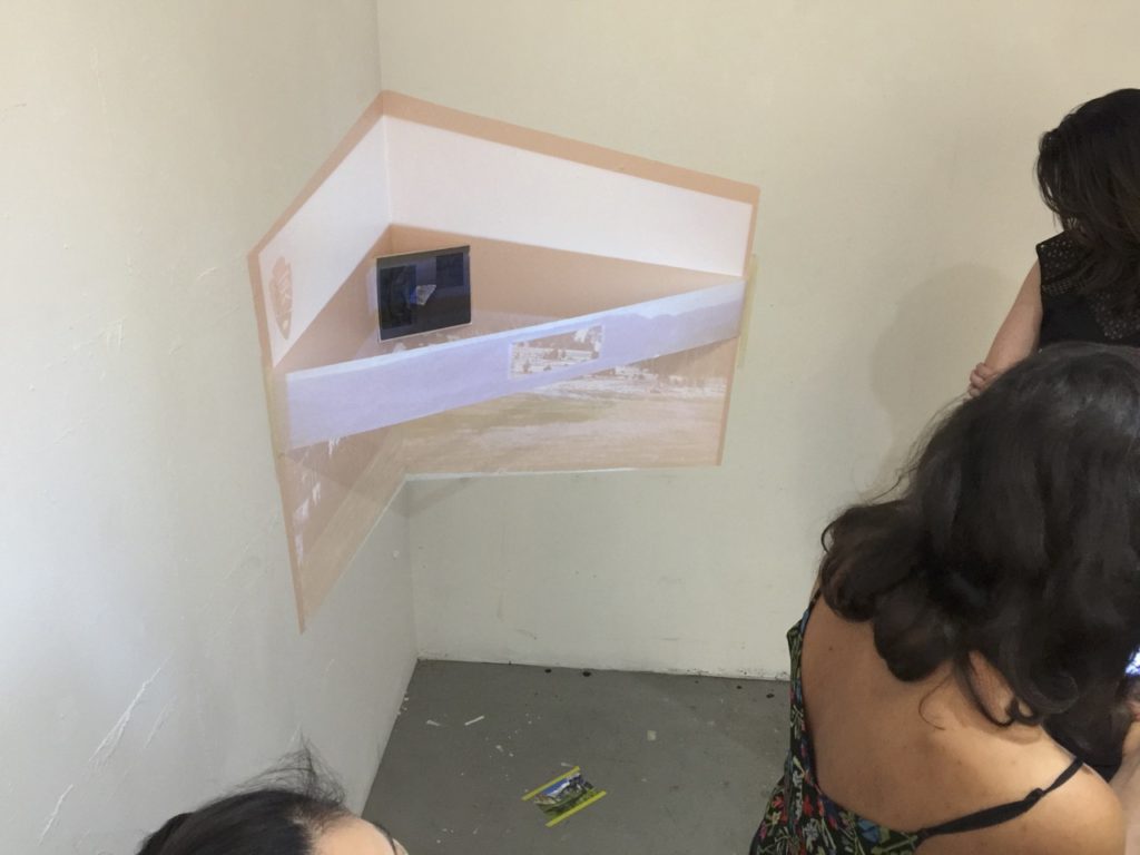
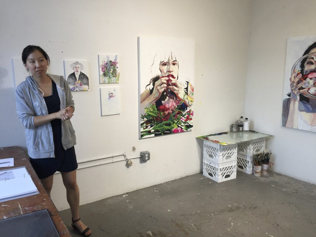
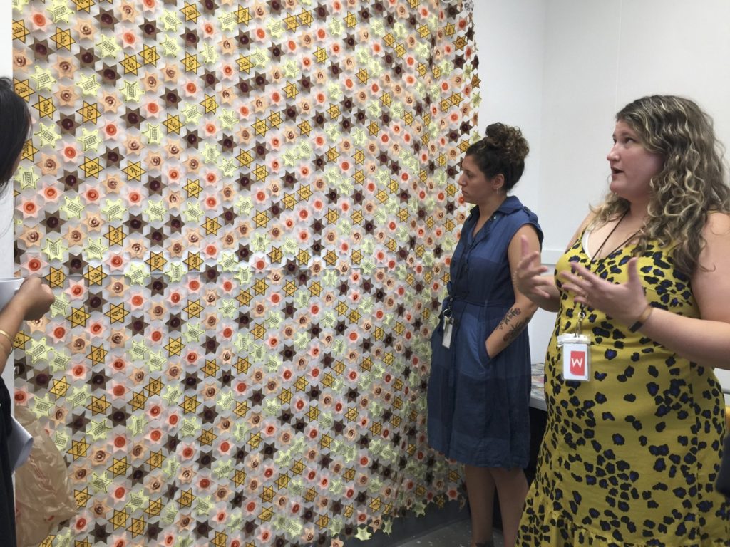
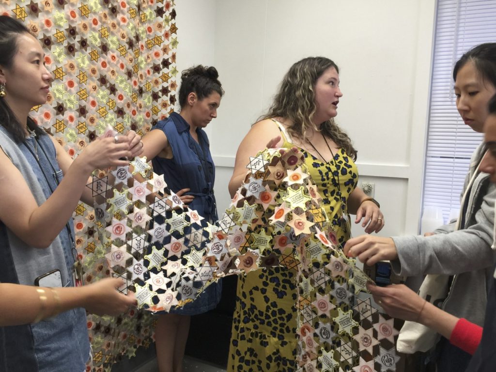
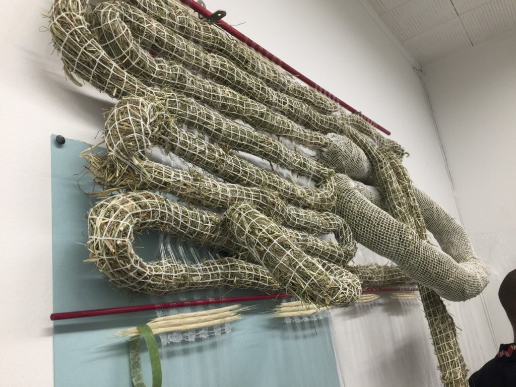
Many July session artists were recent grads from schools like SAIC, Pratt, MICA. The energy and enthusiasm of this group was remarkable. Here are some of the photos I took during our open studios in the order we walked through: Caroline Voagen Nelson, Leah Ke Yi Zheng, Jamaal Peterman, Joshua Reyes, Ariel Basson Freiberg, Miji Shin, Jee Hwang, Rebecca Tennenbaum, Nazanin Noroozi, Leslie Friedman, and Hannah Mitsu Shimabukuro.
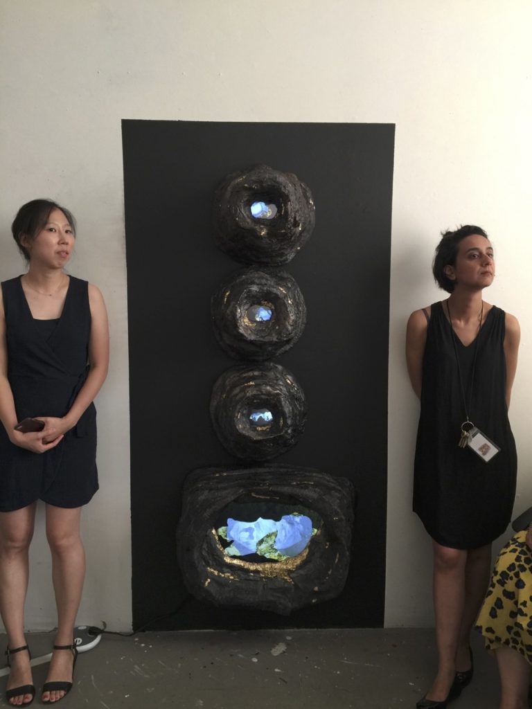
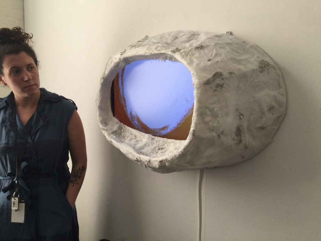
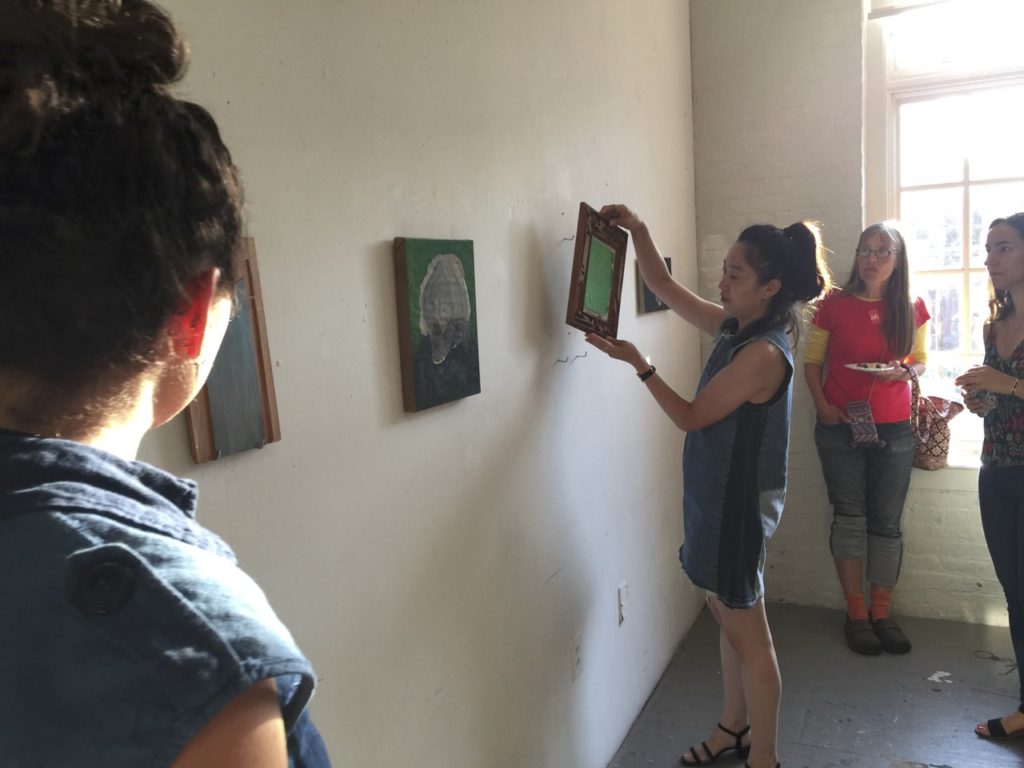
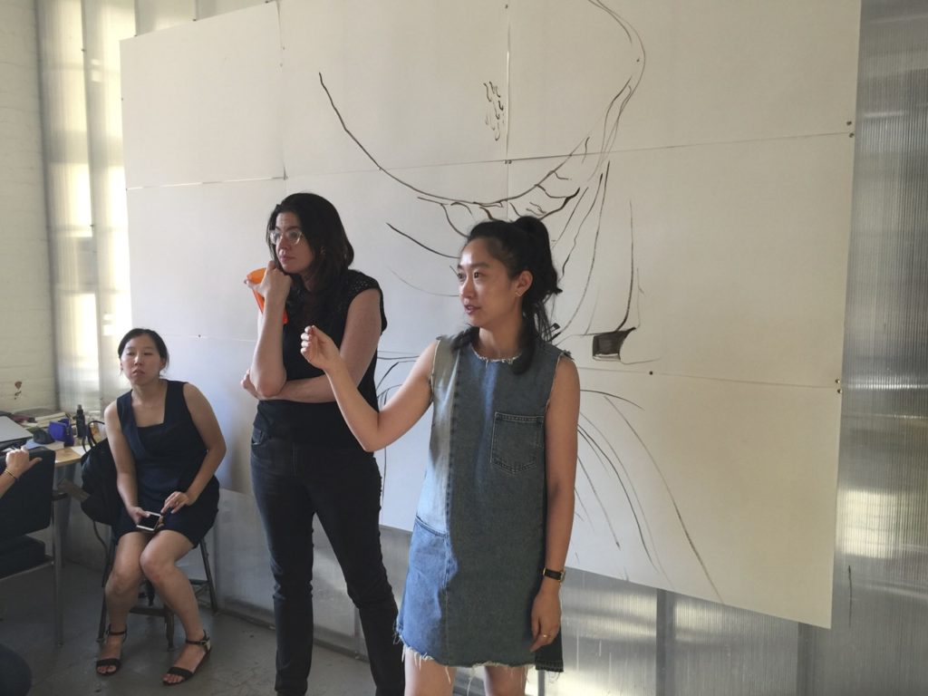
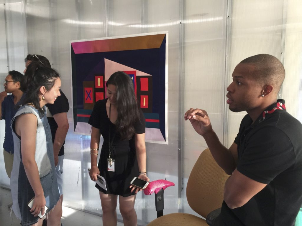
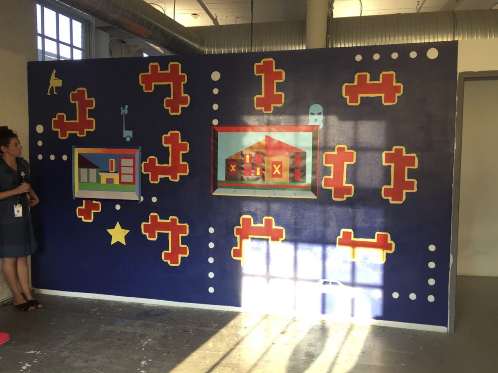
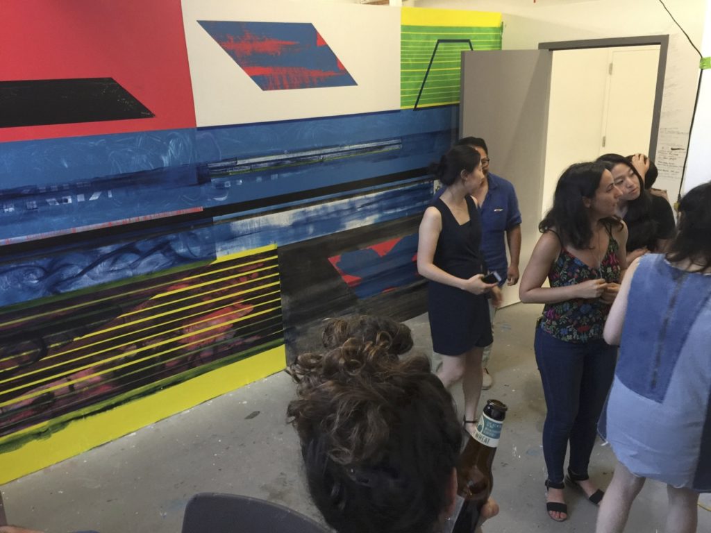
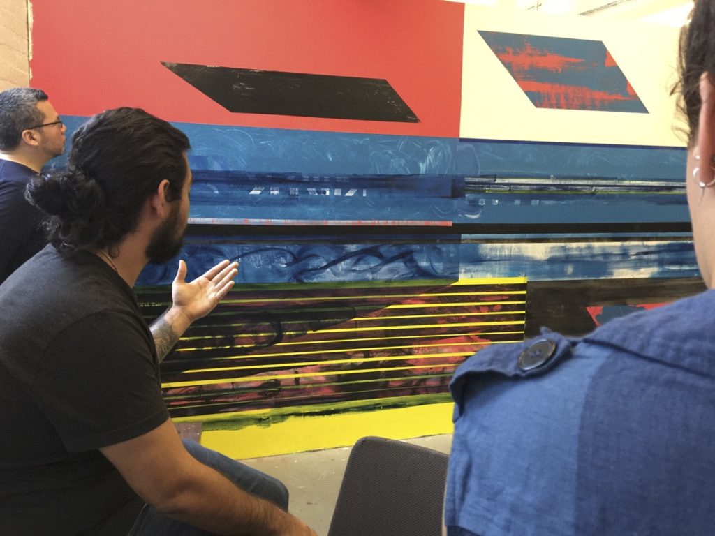
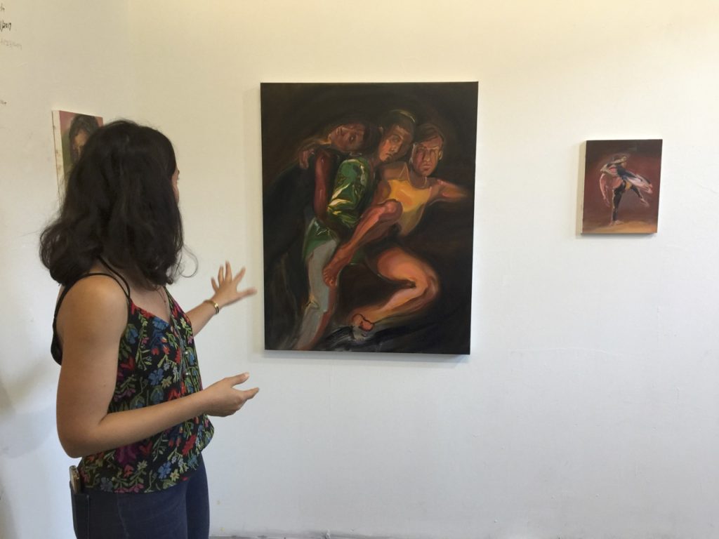
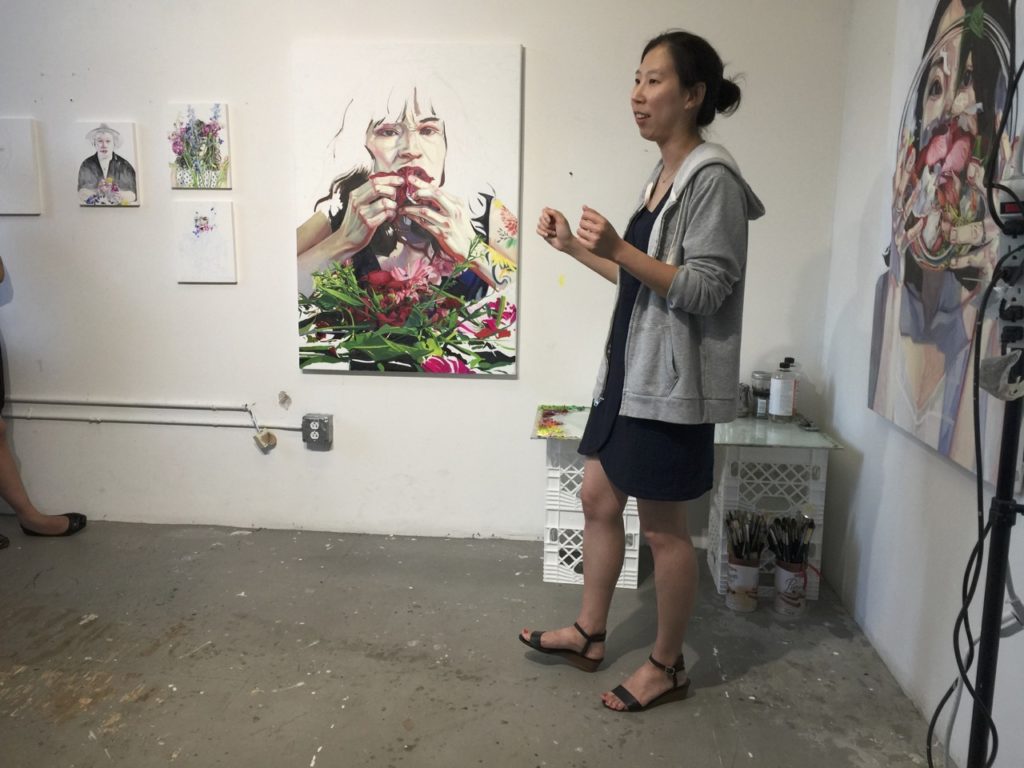
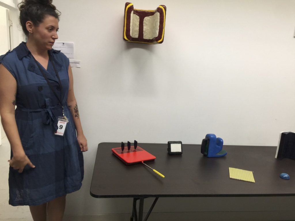
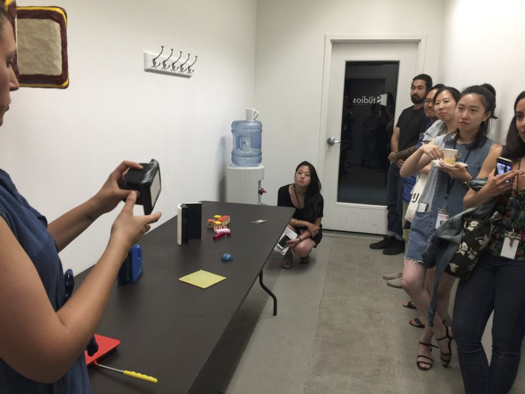
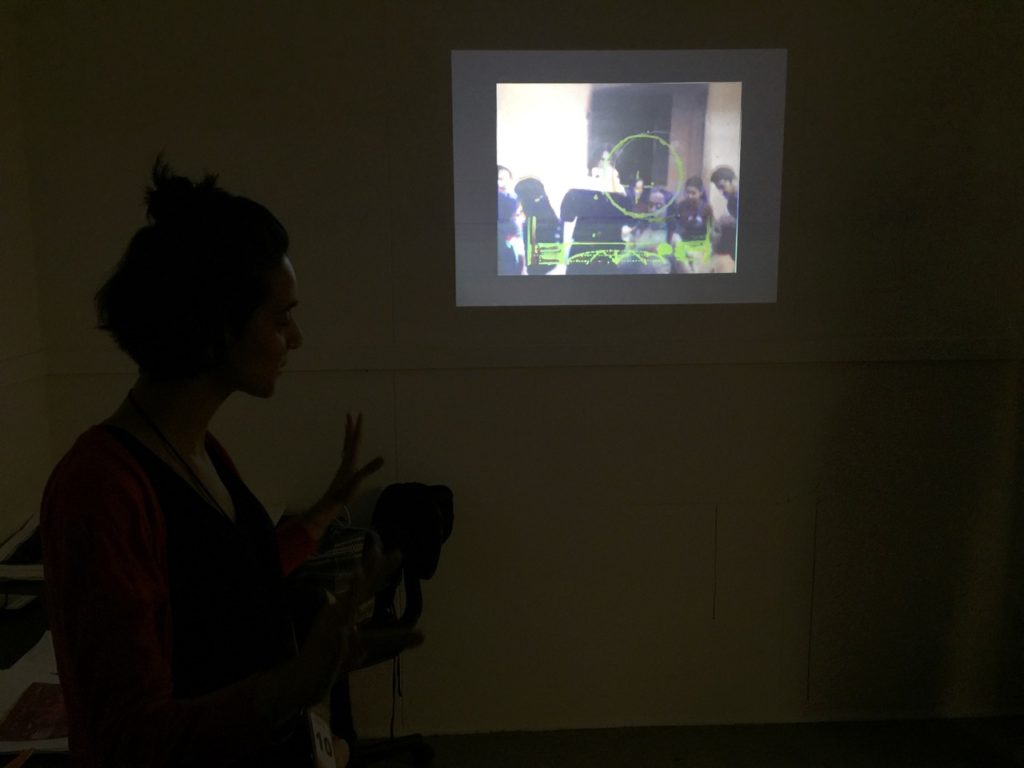
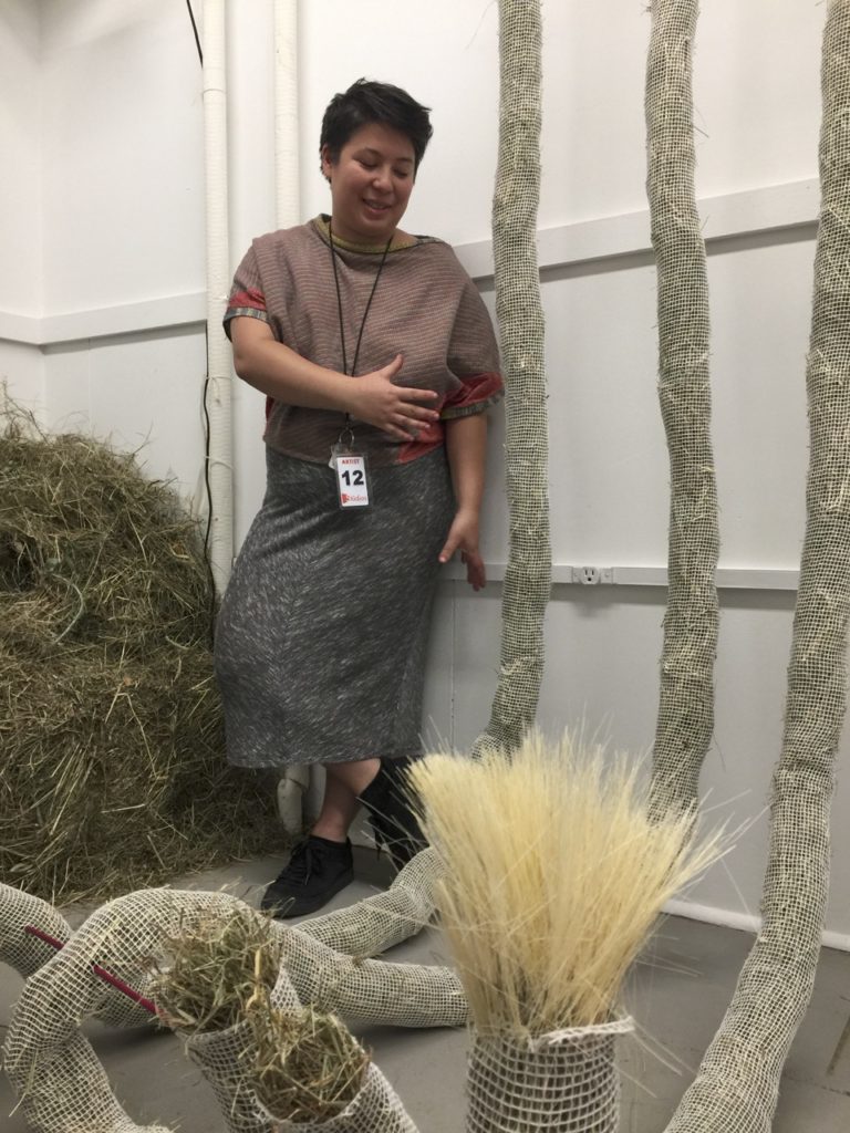


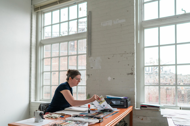
I really enjoyed MASS MoCA and got a lot of work done. With stimulation from both the museum and fellow residents, my studio practice became turbo charged. I rarely experience a shortage of ideas to begin with, but this really took me into some fun experiments. Some of them worked, some didn’t. I feel immensely fortunate and grateful for this departure from familiar routines back home. As I create more drawings in the series, in a month or two I’ll dedicate a separate journal entry to this new body of work.


Vesna,
I happened upon you – somehow connected via the “Settling In at the International Museum of Surgical Science” post. Love your work and the way you communicate your experience.
Thanks for sharing!
_Pam.
I’ve heard about MASS MoCA and it is so nice to get a glimpse into the space. It looks amazing, the residency also. Thanks for sharing. I’ll look forward to seeing the work that emerges from your experience.
I have been a distant but very enthusiastic fan of your website since meeting your work in Chicago at the medical museum.
Your skill as a writer brings all your artistic endeavors to life. Thank you for sharing about a museum unknown to me. Best regards From Tucson Arizona and Santa Monica California
Wonderful journal of your residency, Vesna!
What a great experience, Vesna. Thank you for sharing. I will forward your report on the residency to some friends who are still on the circuit. Betty and I visited a pop up gallery in Bozeman last week that has ties to MASS MoCA. It’s called Tinworks. You might want to check out their website.
What a wonderful journey and story. Thanks for sharing this.