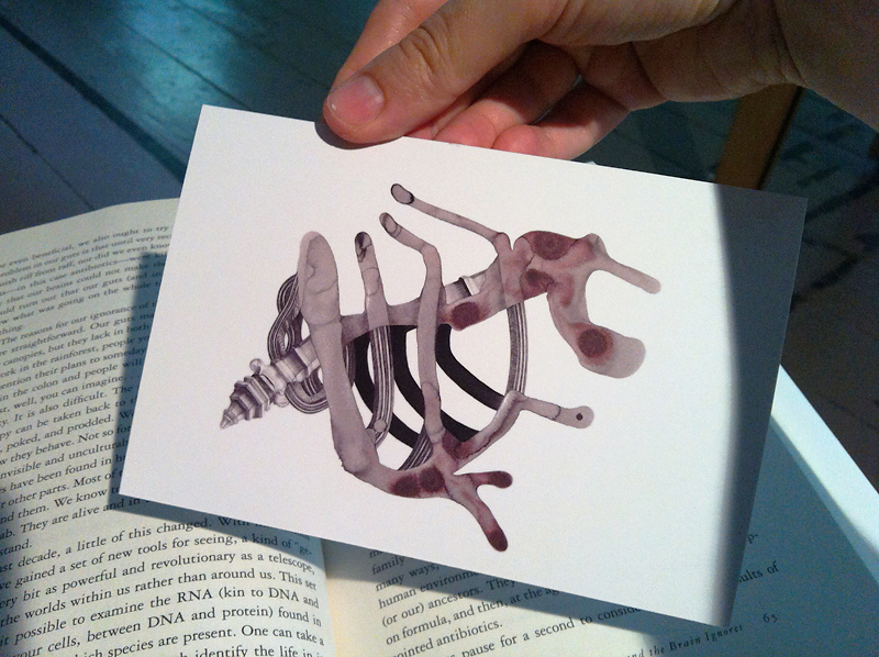
It’s about time that I caught up with my writing and addressed some new ideas the summer residencies have been generating. Both of these residencies (CAC Woodside and ChaNorth) have included so many extra-curricular activities and social events that I’ve tried spending most of my free time doing research and focusing on my artwork. But despite the limited number of workdays left, it has been nice to pause and carefully examine some of my thoughts.
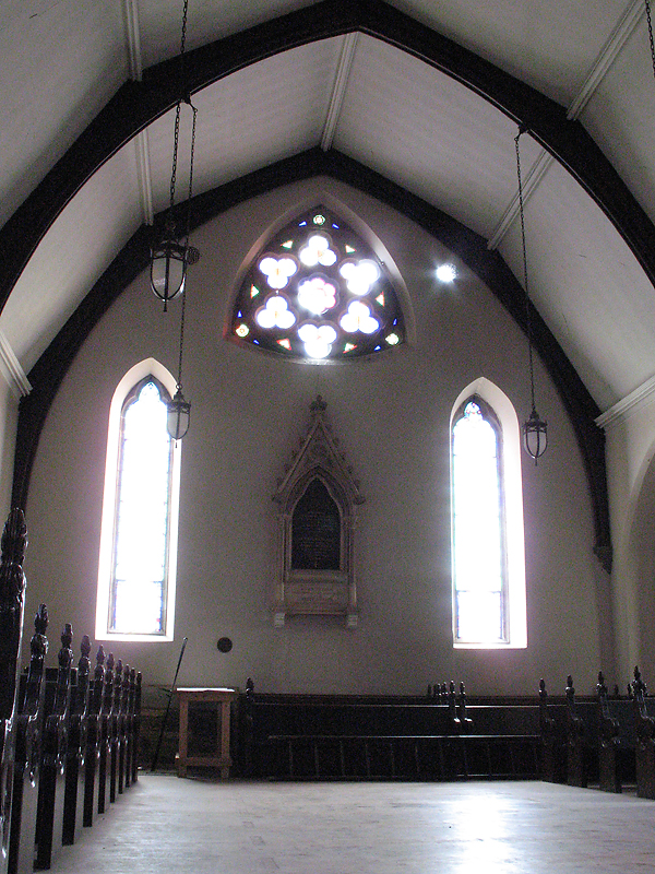
When I arrived at CAC Woodside last month, I already knew that I wanted to draw, but I didn’t know how the new environment would affect my drawings. I was open to circumstance and suggestion. The New Mexico deserts and my altitude sickness influenced my work so much last year at SFAI. Feasibly, something similar could have happened in the Hudson Valley, but it turns out that this hasn’t been the case (at least not so far, not directly). The sources of inspiration have been entirely unpredictable! I will start with the ideas that surfaced at the Woodside buildings in Troy, NY.
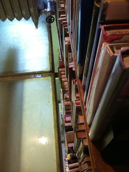
After only a few days of living in the strange setting of the Woodside Chapel – with its labyrinthine structure, peculiar cavities and doorways, and suspended bedrooms high up in the roof space – I decided to visit the Troy Public Library in search of more information about the two Woodside buildings. The Chapel housed the artists, while the old church was under renovation, to be repurposed into a performance and exhibition space about a year from now. The public library proved to be another unusual and very old structure, with glass floors in the stacks area (pictured), bookshelves that emerged between the glass – from the ground all the way to the fourth story, and an antiquated pulley system for moving books up and down. (You can see more photos of this library here.) With the help of a librarian, I found a reference book with building plans and architectural notes about the Woodside historical site. Within a couple of weeks of reading, thinking, sketching, and writing, it was clear to me that I was much more interested in the architecture of these structures than I was in the external surroundings. The library experience highlighted this realization even further. I began thinking about ways in which architecture can influence the human body, mimic it, and in some ways even become an extension of it.
The newly realized ideas surrounding architecture led me to several articles, blogs, and book titles. I found this amazing blog that had many links to topics I was looking for. Not only does it link to an article in Scientific American about how various room designs can affect mood and creativity, it also links to articles on the phenomenon of Biophilia, and on a new design model for introverted students. That last one was especially interesting as it advocated for less emphasis on collaboration in classrooms, and more attention to matching a student’s natural tendencies in a social setting (which may or may not include collaboration).
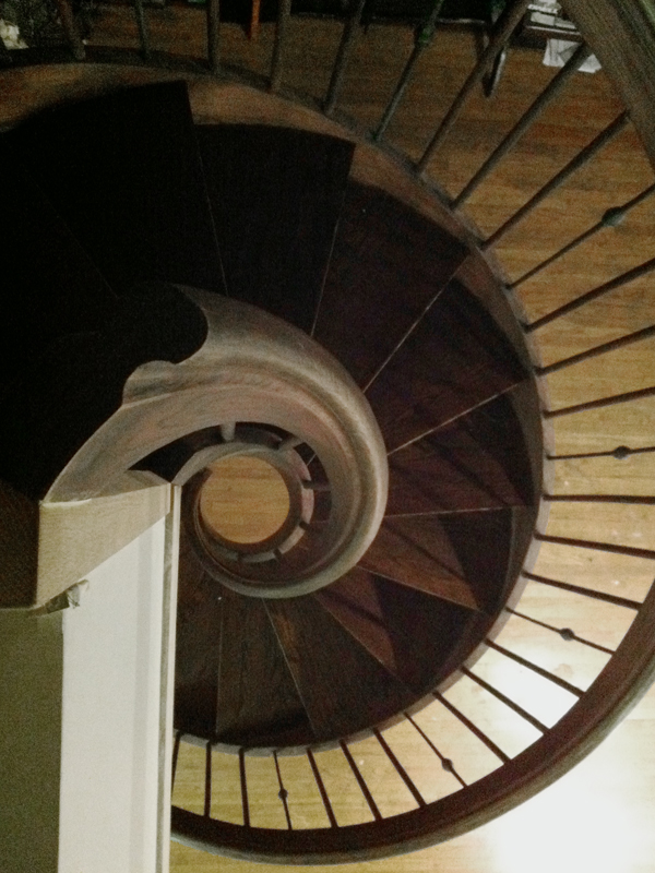
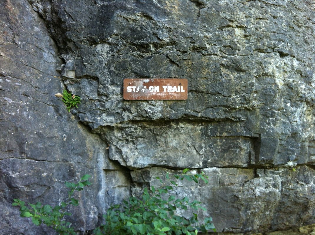
After reading these articles and looking at various other sources, I learned that physical differences in the architectural setting, i.e. ceiling height, brightness, window view, etc. directly correlate with one’s ability to concentrate on certain types of tasks. Then there is this concept of Biophilia – our desire to be surrounded by nature-inspired forms that are based on fractals and symmetry (like this staircase that led to our bedrooms in the Woodside Chapel). Surprisingly enough, these ideas brought me back to some of the things I was thinking about as an undergraduate student: that everything is nature. The natural world includes mountains, rivers, trees, cities, and everything that exists within them. I feel that if we approached nature this way – that if a computer could be seen as a perfectly natural object, like a seashell or an anthill – we wouldn’t have the strangely romanticized, mediated, and twisted relationship with what we perceive to be somehow more natural. Treating “nature” as more precious than a human creation sets a condition not only for misanthropy, but also for a codependent relationship with our environment. In my previous entry I wrote about the sadness that I experienced while looking at the Niagara Falls from a distance. I realize now what made me feel unsettled; it was the outward manifestation of our desire to frame and harness things that we perceive as more natural and therefore more beautiful. We inevitably enjoy all of these things through a great deal of arbitration, whether it be via viewing paths (like the Indian Ladder Trail, where I found this “Stay on Trail” sign) and concrete structures that were built around these “natural” sites, or simply through the act of preservation. I believe that if we are in search of natural beauty, we can find it even in the most mundane, manufactured of objects. In this sense, while we collect seashells and revel at their beauty, bees might go on vacation to revel in a field of cars, toothbrushes, and light bulbs, asking each other “Look at this. Isn’t nature amazing?”
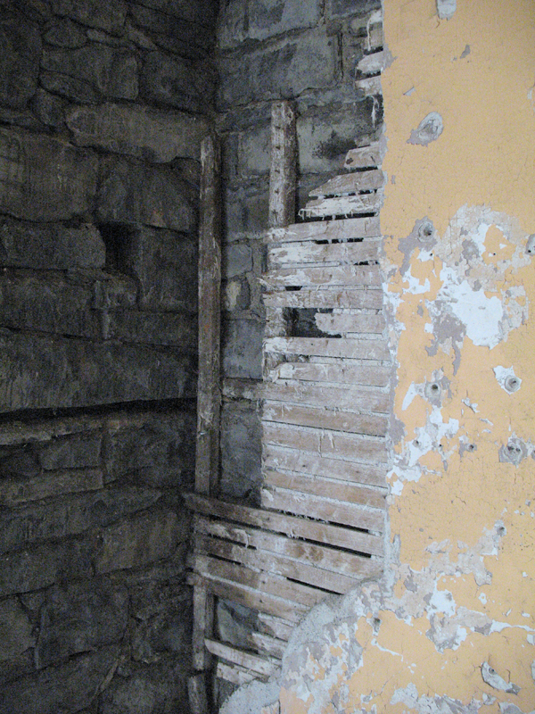
To get back on topic, I began my work while in residence at CAC Woodside by thinking about the ways in which architecture can relate to the human body: influencing it, mimicking it (like these layers in the Woodside Church wall or the ribcage-like vault pictured at the top), and maybe even becoming one with it. I had brought such a large selection of inkblots to work with that I decided I would draw on those without spilling any more ink. After about a week or two of research and photography, I finally began drawing.
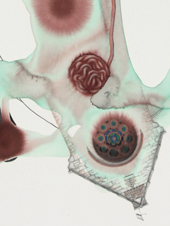
The drawings depicted buildings transforming into skin cells, stained glass floating amongst various organs such as eyes and teeth, and a ribcage morphing into the vault of the Woodside church. In fact, the ribcage piece, Thoracic Vault, quickly became my favorite. There is a certain amount of substance and authenticity to this piece, as though it is a legitimate creature. In order to complete it, I used my own photographs of the Woodside Church interior and combined this imagery with antiquated illustrations of a human ribcage. The other work doesn’t bear as strong of an impression on me, except for maybe the skin/roof piece, a detail of which is on the right (no title yet). All things considered, I took some risks and came out with two or three Pareidolia pieces that I am relatively happy with. But there is so much more to explore within this topic. I can’t even imagine where this interest in architecture would have taken me had I spent a year or so at this residency. I wrote down some ideas for the future, and I realize now that I discovered the tip of an iceberg that will inevitably emerge in other architectural settings, maybe even back home in Chicago.